set.seed(42)
n <- 50
runs <- 1e3

pvalues <- NULL

for (i in 1:runs) {
  control <- rnorm(n)
  treatment <- rnorm(50)

  t <- t.test(control, treatment)

  pvalues[i] <- t$p.value

}

hist(pvalues)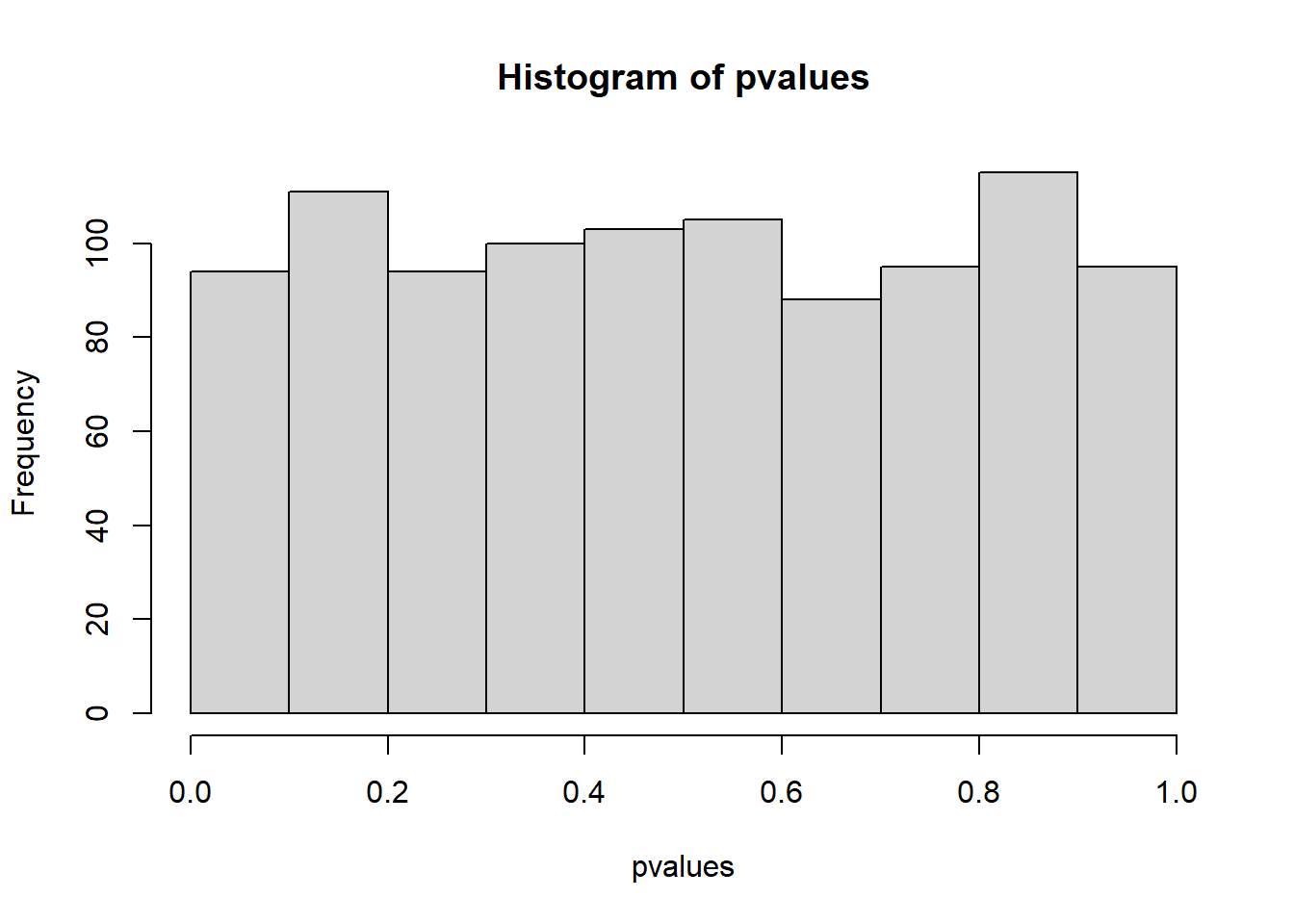
Welcome to the next set of exercises. At this point, I hope you feel somewhat comfortable with the logic of simulations as well as the commands that get you there. Now we’ll try to use these commands to add to your understanding of effect sizes and add an extra layer (aka another loop level). That’s what you’ll do in the first block.
In the second block, we’ll add a tad more complexity. You’ll get going with correlated measures (aka paired-sampled t-test) and get to know the while command.
What’s the distribution of p-values when there’s no effect? Create two independent groups, both with the same mean and standard deviation in rnorm (because there’s no effect). Use rnorm’s default mean and SD. Each group should have 50 participants. Run an independent, two-tailed t-test and store the p-value. Repeat 10,000 times. Now plot the p-values as a histogram (hist). Did you expect them to look like this?
set.seed(42)
n <- 50
runs <- 1e3
pvalues <- NULL
for (i in 1:runs) {
control <- rnorm(n)
treatment <- rnorm(50)
t <- t.test(control, treatment)
pvalues[i] <- t$p.value
}
hist(pvalues)
Nothing fancy here. Start with declaring your variables, create an object to store the p-values, then create two groups and run a t-test in a loop:
for (i in 1:?) {
  control <- ?
  treatment <- ?

  t <- t.test(control, treatment)

  # store the p-value
  ? <- t$p.value

}Now let’s check empirically why p-values alone don’t tell us much. Repeat your simulation from above, but this time create two “experiments” per run: One where there’s no difference (like you already have above, with mean = 0 and SD = 1), but also one where there’s a massive difference (at least mean = 0.8, SD = 1). Store the p-values of the no difference experiments and the p-values of the massive difference experiments in a data frame, with one variable for condition and one for pvalue.
Now plot both as densities (so two density lines). Us this code (call the data frame d and the number of simulations runs):
library(ggplot2)

ggplot(d, aes(x = pvalue, color = condition)) + geom_density() + xlim(c(0, 0.05)) + ylim(c(0, runs/5)) + theme_bw()
Look at the p = 0.04. If were to run an experiment, not knowing which reality (no effect or massive effect) our experiments comes from, which one is more likely with a p-value of 0.04? If all we know is that our p-value is 0.04, what’s our best bet for the reality our experiment comes from: no effect or massive effect?
n <- 50
runs <- 1e3

d <-
  data.frame(
    null = NULL,
    effect = NULL
  )

for (i in 1:runs) {
  control1 <- rnorm(n)
  treatment1 <- rnorm(n)

  t1 <- t.test(control1, treatment1)

  control2 <- rnorm(n)
  treatment2 <- rnorm(n, 0.8)

  t2 <- t.test(control2, treatment2)

  d <-
    rbind(
      d,
      data.frame(
        condition = c("null", "effect"),
        pvalue = c(t1$p.value, t2$p.value)
      )
    )

}

library(ggplot2)

ggplot(d, aes(x = pvalue, color = condition)) + geom_density() + xlim(c(0, 0.05)) + ylim(c(0, runs/5)) + theme_bw()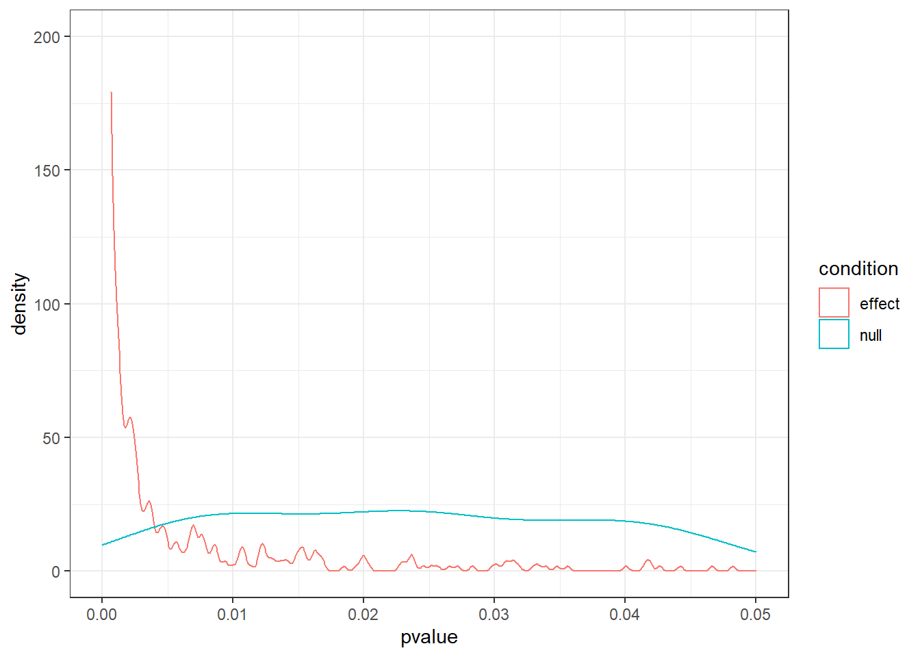
You do the same as above, only this time you do two “experiments” inside the loop and therefore store two results.
d <-
  data.frame(
    null = NULL,
    effect = NULL
  )

for (i in 1:?) {

  # no difference experiment
  control1 <- ?
  treatment1 <- ?

  t1 <- # first t-test

    # massive difference experiment
  control2 <- ?
  treatment2 <- ?

  t2 <- ?

    # then store them in a data frame
  d <-
    rbind(
      d,
      data.frame(
        condition = c("null", "effect"),
        pvalue = c(t1$p.value, t2$p.value)
      )
    )

}Google “Lindley’s paradox”. Let’s return to our alpha (0.05) in one of the next sessions: but keep this in mind.
Let’s expand on our simulation skills from the previous sessions. In previous sessions, we simulated t-tests for different sample sizes over many repetitions. That was a loop in a loop: We’re looping over sample size, then, for each sample size, we looped over the number of simulations. Now, let’s add another layer: the effect size.
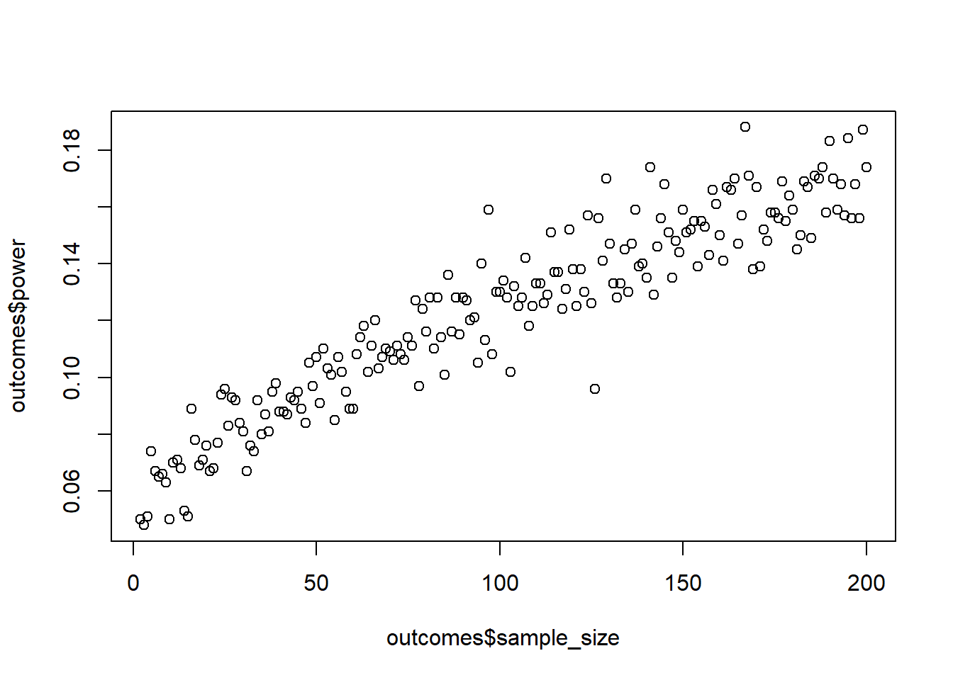
Create a simulation for an independent t-test. The mean for the control group should be 4 with an SD of 1. The means for the treatment group should be 4.2 (small), 4.5 (medium), and 4.8 (large), with an SD that’s always 1. Create a data.frame, store effect_size (so the difference in means between the groups: small, medium, and large), the sample size (from 20:100), and the mean power for this effect size and sample size.
Tip, you could go about this with the following structure:
for (asize in c(4.2, 4.5, 4.8)) {
  for (asample in minimum:maximum) {
    for (arun in 1:runs) {

    }

  }
}
Go for 200 runs for each combination of effect size and sample size. Plot the results afterwards with (assuming your data frame is called outcome):
library(ggplot2)

ggplot(outcome, aes(x = sample_size, y = power, color = as.factor(effect_size))) + geom_line() + theme_bw()set.seed(42)
effect_sizes <- c(4.2, 4.5, 4.8)
min_sample <- 20
max_sample <- 100
runs <- 200
sd <- 1
outcome <-
data.frame(
effect_size = NULL,
sample_size = NULL,
power = NULL
)
for (asize in effect_sizes) {
for (asample in min_sample:max_sample) {
run_results <- NULL
for (arun in 1:runs) {
control <- rnorm(asample, 4, sd)
treatment <- rnorm(asample, asize, sd)
t <- t.test(control, treatment)
run_results[arun] <- t$p.value
}
outcome <-
rbind(
outcome,
data.frame(
effect_size = asize,
sample_size = asample,
power = sum(run_results<0.05) / length(run_results)
)
)
}
}
ggplot(outcome, aes(x = sample_size, y = power, color = as.factor(effect_size))) + geom_line() + theme_bw()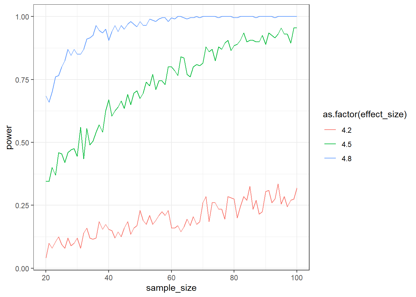
Let’s fill in the provided structure:
effect_sizes <- ?
min_sample <- ?
max_sample <- ?
runs <- 200
sd <- 1

# a data frame to store all of our results
outcome <-
  data.frame(
    effect_size = NULL,
    sample_size = NULL,
    power = NULL
  )

for (asize in effect_sizes) { # iterate over the differences in effect sizes

  for (asample in min_sample:max_sample) {

    # somewhere to store the results of the following 200 runs
    run_results <- NULL

    for (arun in 1:runs) {
      control <- rnorm(?, 4, sd)
      treatment <- rnorm(?, ?, sd)

      t <- t.test(control, treatment)

      run_results[arun] <- t$p.value
    }

    # store it all
    outcome <-
      rbind(
        outcome,
        data.frame(
          effect_size = asize,
          sample_size = asample,
          power = ?
        )
      )
  }
}Guess what? The power analysis you did above was on the standardized scale. Do you know why? Let’s look at the formula for Cohen’s d again:
\(d = \frac{M_1-M_2}{pooled \ SD}\)
Above, our means were 4 for the control group, and 4.2, 4,5, and 4.8 for the treatment group. Crucially, the SD was 1 for all groups. That means, very conveniently, that the differences are 0.2, 0.5, and 0.8 standard deviations–and Cohen’s \(d\) is measured in standard deviations. 0.2, 0.5, and 0.8 are also the heuristics for a small, medium, and large effect, respectively.
You can verify that yourself. Simulate a normally distributed control group (10,000 cases) with a mean of 100 and an SD of 1. Also simulate a treatment group with a mean of 101 and and SD of 1. Then do two more groups, but this time increase the SD for both groups to 2. What should happen to Cohen’s \(d\) from the first comparison to the second? Verify your intuition by using the effectsize::cohens_d function.
n <- 1e4
control1 <- rnorm(n, 100, 1)
treatment1 <- rnorm(n, 101, 1)

control2 <- rnorm(n, 100, 2)
treatment2 <- rnorm(n, 101, 2)

effectsize::cohens_d(control1, treatment1)
Cohen's d | 95% CI
--------------------------
-0.99 | [-1.02, -0.96]
- Estimated using pooled SD.effectsize::cohens_d(control2, treatment2)Cohen's d | 95% CI
--------------------------
-0.49 | [-0.52, -0.46]
- Estimated using pooled SD.Probably the easiest way to simulate standardized effects is to simply rely on variables that are already standardized. Look up the default values of rnorm. SD here is set to 1, so whatever difference we put down as the difference in means between the two groups will be our Cohen’s \(d\). Simulate power for a Cohen’s \(d\) of 0.1 in an independent, two-tailed t-test for a sample size ranging from 10:1000. Use 200 simulations per sample size (or more, if you’re fine waiting for a couple of minutes). Before looking at the results: How many people do you think you’ll need per group for 95% power? Verify that in GPower.
set.seed(42)

draws <- 200
min_sample <- 10
max_sample <- 1000
cohens_d <- 0.1

outcomes <- data.frame(
  sample_size = NULL,
  power = NULL
)

for (i in min_sample:max_sample) {

  pvalues <- NULL

  for (j in 1:draws) {
    control <- rnorm(i)
    treatment <- rnorm(i, cohens_d)

    t <- t.test(control, treatment)
    pvalues[j] <- t$p.value
  }

  outcomes <- rbind(
    outcomes,
    data.frame(
      sample_size = i,
      power = sum(pvalues<0.05)/length(pvalues)
    )
  )
}

plot(outcomes$sample_size, outcomes$power, type = "l")
abline(h = 0.80)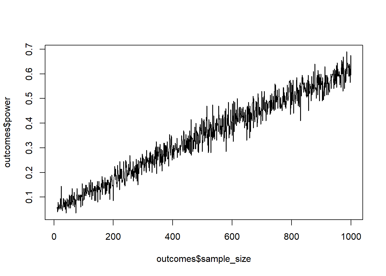
Nothing here should be new. You define the parameters first, then apply a loop to every sample size, and for every sample size, you do a number of simulations and extract the p-values.
draws <- ?
min_sample <- ?
max_sample <- ?
cohens_d <- ?

# our outcome
outcomes <- data.frame(
  sample_size = NULL,
  power = NULL
)

# first loop over the different sample sizes
for (i in ?:?) {

  # store our pvalues somewhere

  # second loop over the draws/runs
  for (j in 1:?) {
    control <- rnorm(i)
    treatment <- rnorm(i, ?)

    t <- t.test(control, treatment)

    # store that pvalue in the object your create in the first loop level
  }

  # store the results for this sample size in out outcomes
  outcomes <- rbind(
    outcomes,
    data.frame(
      sample_size = ?,
      power = ? # proportion of p-values < 0.05 for this sample size
    )
  )
}
You can use the following code for plotting: plot(outcomes$sample_size, outcomes$power, type = "l"); abline(h = 0.80).
How much power do we gain if we specify the direction of a test? Run a simulation with a Cohen’s \(d\) of 0.5 for sample sizes of 20 to 100 (1,000 samples each). For each run, do a one-tailed and a two-tailed t-test. Then plot the power curves and calculate the average power (across all sample sizes) for the two.
If you store the following data frame, you can use the below code for plotting.
ggplot(outcomes, aes(x = sample_size, y = power, color = as.factor(type))) + geom_line() + theme_bw()set.seed(42)
draws <- 1e3
min_sample <- 20
max_sample <- 100
cohens_d <- 0.5
outcomes <-
data.frame(
sample_size = NULL,
type = NULL,
power = NULL
)
for (i in min_sample:max_sample) {
pvalues_one <- NULL
pvalues_two <- NULL
for (j in 1:draws) {
control <- rnorm(i)
treatment <- rnorm(i, cohens_d)
t_one <- t.test(control, treatment, alternative = "less")
t_two <- t.test(control, treatment, alternative = "two.sided")
pvalues_one[j] <- t_one$p.value
pvalues_two[j] <- t_two$p.value
}
outcomes <- rbind(
outcomes,
data.frame(
sample_size = c(i, i),
type = c("one-sided", "two-sided"),
power = c(sum(pvalues_one<0.05)/length(pvalues_one), sum(pvalues_two<0.05)/length(pvalues_two))
)
)
}
aggregate(outcomes$power, by = list(outcomes$type), mean) Group.1 x
1 one-sided 0.8121111
2 two-sided 0.7269630ggplot(outcomes, aes(x = sample_size, y = power, color = as.factor(type))) + geom_line() + theme_bw()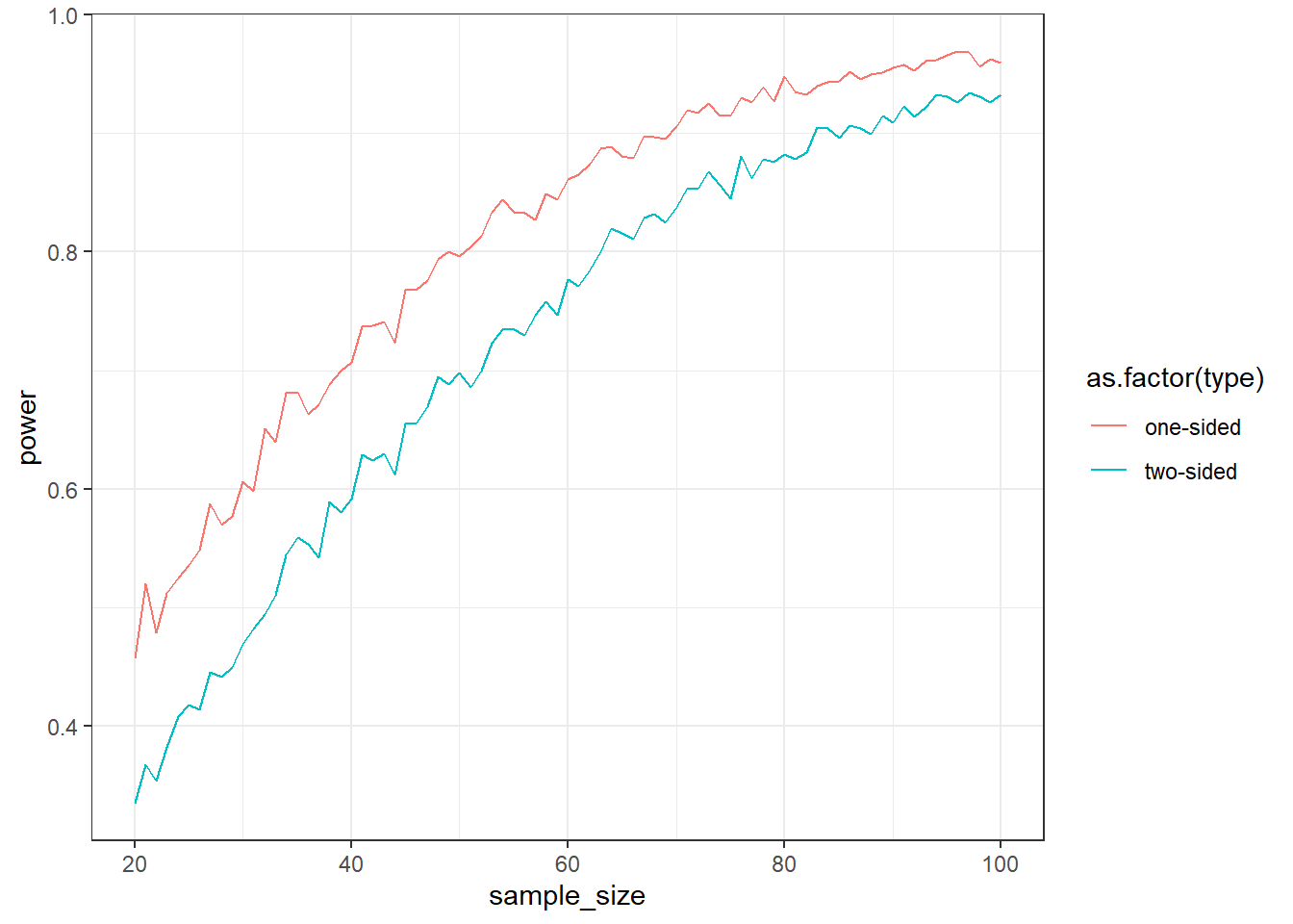
You do the same as above, except this time you perform two t-tests inside the second loop:
control <- rnorm(?)
treatment <- rnorm(?, ?)

t_one <- t.test(control, treatment, alternative = "less")
t_two <- t.test(control, treatment, alternative = "two.sided")
You can get power for each type by running aggregate(outcomes$power, by = list(outcomes$type), mean).
So far, getting a pooled SD was easy because it was the same in both groups. Let’s see how we can simulate standardized effect sizes (Cohen’s \(d\) in this case). Write a function that calculates the pooled SD from two SDs. The formula:
\(pooled = \sqrt{\frac{(sd_1^2 + sd_2^2)}{2}}\)
Then think about two groups that have different SDs. Say we measured something on a 7-point scale. The control group has an SD of 0.5, whereas the treatment group has an SD of 1.7.
How large does the difference in means have to be for a \(d\) of 0.25? Prove it with a simulation, using the following code:
n <- 1e4

control <- rnorm(n, ?, 0.5)
treatment <- rnorm(n, ?, 1.7)

effectsize::cohens_d(control, treatment)
pooled_sd <-
function(
sd1,
sd2){
p_sd <- sqrt((sd1**2 + sd2**2)/2)
return(p_sd)
}
n <- 1e4
sd <- pooled_sd(0.5, 1.7)
cohens_d <- 0.25
control <- rnorm(n, 4, 0.5)
treatment <- rnorm(n, 4 + sd*cohens_d, 1.7)
effectsize::cohens_d(control, treatment)Cohen's d | 95% CI
--------------------------
-0.24 | [-0.31, -0.21]
- Estimated using pooled SD.This one isn’t much about coding, but about understanding the concept behind effect sizes. First, let’s do the function.
pooled_sd <-
  function(
    sd1,
    sd2){

    p_sd <- ? # cohen's formula

    return(p_sd)
  }
Now you can feed the two SDs to the formula: pooled_sd(0.5, 1.7). There you go. That’s your unit for a standardized effect size. If one group is 0.25 units larger than the other, all we need to do is feed pooled_sd * cohens_d into rnorm as the mean for the treatment group.
Do the above again, but this time add 1 to the mean of both control group and treatment group. What do you notice?
control <- rnorm(n, 5, 0.5)
treatment <- rnorm(n, 5 + sd*cohens_d, 1.7)

effectsize::cohens_d(control, treatment)
Cohen's d | 95% CI
--------------------------
-0.23 | [-0.26, -0.20]
- Estimated using pooled SD.The above example shows how arbitrary it can be to go for a standardized effect size. You calculated power in two ways:
The first option is easy, but comes with all the limitations of standardized effect sizes we talked about. The second option requires much more thought–but it ignores the absolute level of the means because you only specify means in their distance from each other in SD units. In fact, I’d argue that if you’ve made it this far and thought about the variation in your measures, you might as well think about the means and their differences in raw units.
Standard deviations can be really hard to determine. In that case, you could also examine uncertainty around the SDs of each group. Simulate an independent t-test (one-sided, 1,000 simulations) over sample sizes 50:150. The control group has a mean of 100, the treatment group a mean of 105. Simulate over two conditions: Where the SD (both groups have the same SD) is 10 and one where it’s 25.
This time, save everything in a data frame: The sd (small or large), the sample_size, the number of the run, and the pvalue. That means your data frame will have 2 SD x 50 sample sizes x 1,000 simulations. With the data frame, get the power per SD and sample size (tip: use aggregate or group_by if you use the tidyverse). For example: aggregate(pvalue ~ sd + sample_size, data = outcomes, FUN = function(x) sum(x<.05)/length(x)). Then plot the two power curves. You can use the following code:
library(ggplot2)

ggplot(d, aes(x = sample_size, y = power, color = as.factor(sd))) + geom_line() + theme_bw()
Start with the following structure:
for (an_sd in c(10, 25)) {
  for (n_size in 50:150) {
    for (run in 1:1e3) {

    }

  }
}
Pay attention to two things: What does it do to your runtime? (Spoiler: It’ll take a while!). Second: How does the SD influence power?
min_sample <- 50
max_sample <- 150
runs <- 500
sds <- c(10, 25)

outcomes <-
  data.frame(
    sd = NULL,
    sample_size = NULL,
    run = NULL,
    pvalue = NULL
  )

for (ansd in sds) {

  for (asize in min_sample:max_sample) {

    for (arun in 1:runs) {

      control <- rnorm(asize, 100, ansd)
      treatment <- rnorm(asize, 105, ansd)

      t <- t.test(control, treatment, alternative = "less")

      outcomes <-
        rbind(
          outcomes,
          data.frame(
            sd = ansd,
            sample_size = asize,
            run = arun,
            pvalue = t$p.value
          )
        )
    }
  }
}

library(tidyverse)
d <- outcomes %>% group_by(sd, sample_size) %>% summarise(power = sum(pvalue<0.05)/n()) %>% ungroup()

ggplot(d, aes(x = sample_size, y = power, color = as.factor(sd))) + geom_line() + theme_bw()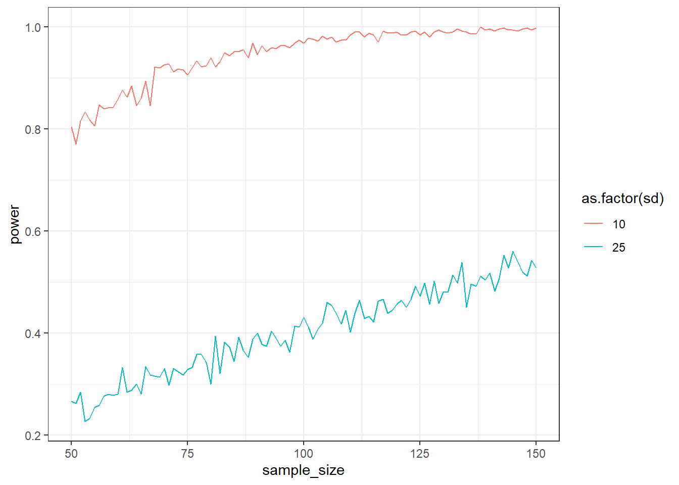
This is a 3-level loop, starting with the SD, then the sample size, then the actual simulations. We’ll also need to store everything this time, so our results data frame will be large. That also means no need for storing summaries per run (our pvalues in earlier simulations).
min_sample <- ?
max_sample <- ?
runs <- ?
sds <- c(?, ?)

# a data frame for us to store everything
outcomes <-
  data.frame(
    sd = NULL,
    sample_size = NULL,
    run = NULL,
    pvalue = NULL
  )

# first level: SDs
for (ansd in sds) {

  # second level: sample size
  for (asize in min_sample:max_sample) {

    # third level: runs
    for (arun in 1:runs) {

      control <- rnorm(?, 100, ?)
      treatment <- rnorm(?, 105, ?)

      t <- t.test(control, treatment, alternative = "less")

      # then we store everything from this run
      outcomes <-
        rbind(
          outcomes,
          data.frame(
            sd = ?,
            sample_size = ?,
            run = ?,
            pvalue = ? # single p-value
          )
        )
    }
  }
}
Get the power per combo with aggregate: aggregate(pvalue ~ sd + sample_size, data = outcomes, FUN = function(x) sum(x<.05)/length(x))
Alright, now let’s get familiar with the while function. Simulate (200 runs) an independent (we’ll go paired soon enough) t-test (two-tailed) for two different effect sizes. The SD for both groups is 2. The mean for the control group is 100. In the small effects condition, the treatment group is 0.5 points larger. In the large effects condition, the treatment group is 1 points larger.
Start at a sample size of 25 and stop when you reach 95% power. Plot the power curve and show that the larger effect size stops much earlier.
for (asize in c(0.5, 1)) {
  n <- 1
  power <- 0
  while (power < 0.95) {
    for (i in 1:runs) {
    }
    power <- ?

    n <- n + 1
  }

}

library(ggplot2)

ggplot(outcomes, aes(x = sample_size, y = power, color = as.factor(effect_size))) + geom_line() + geom_hline(yintercept = 0.95) + theme_bw()
effect_sizes <- c(small = 0.5, large = 1)
draws <- 200
outcomes <- data.frame(
effect_size = NULL,
sample_size = NULL,
power = NULL
)
for (asize in effect_sizes) {
n <- 30
power <- 0
while (power < 0.95) {
pvalues <- NULL
for (i in 1:draws) {
control <- rnorm(n, 100, 2)
treatment <- rnorm(n, 100 + asize, 2)
t <- t.test(control, treatment)
pvalues[i] <- t$p.value
}
power <- sum(pvalues < 0.05) / length(pvalues)
outcomes <- rbind(
outcomes,
data.frame(
effect_size = asize,
sample_size = n,
power = power
)
)
n <- n + 1
}
}
ggplot(outcomes, aes(x = sample_size, y = power, color = as.factor(effect_size))) + geom_line() + geom_hline(yintercept = 0.95) + theme_bw()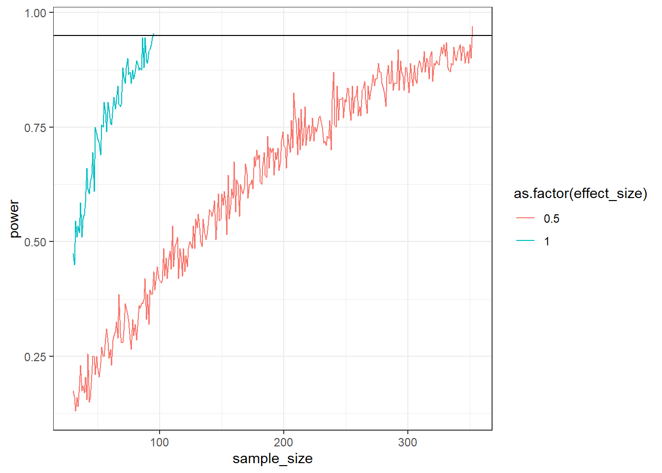
Remember that the logic is different. You start at the lowest sample size, then you run 200 simulations for this sample size, check whether it’s below 95% and, if so, increase the sample size. You do this until power reaches our desired level.
effect_sizes <- c(small = ?, large = ?)
draws <- ?

# store our results
outcomes <- data.frame(
  effect_size = NULL,
  sample_size = NULL,
  power = NULL
)

# we iterate over the two effect sizes; everything below we do for 0.5, and then again for 1
for (asize in effect_sizes) {

  # our starting sample size
  n <- 30
  # our starting power
  power <- 0

  # then our while statement: everything stops once we reach 95% power
  while (power < 0.95) {

    # somewhere to store p-values
    pvalues <- NULL

    # so while statement not satisfied, so we do simulations with the current sample size
    for (i in 1:draws) {
      control <- rnorm(n, ?, 2)
      treatment <- rnorm(n, ?, 2)
      t <- t.test(control, treatment)

      pvalues[i] <- t$p.value
    }

    # now we store power
    power <- ?

    # and put everything into our data frame
    outcomes <- rbind(
      outcomes,
      data.frame(
        effect_size = asize,
        sample_size = n,
        power = power
      )
    )

    # we need to increase the sample size because now we "go up" and check whether power < 95%; if not, we'll do this all again with our new n that is increased by 1
    n <- n + 1
  }
}You’re measuring people’s mood twice: right before and right after lunch. You know from extensive study on effect sizes that mood needs to increase by 1 point on a 7-point scale for other people to notice. You assume the SD is somewhere around 1.5, with a bit more variation before lunch (1.7) than after lunch (1.5). You also assume that mood is correlated to some degree, say 0.5.
You have budget for a maximum sample of 100. How many people do you need to measure to achieve 87% power to detect this 1-point effect–and do you need to go to your max? Use 500 simulations per run. (Tip: the samples are correlated, so you’ll need to specify a variance-covariance matrix.) Verify with GPower.
library(MASS)

runs <- 500
min_sample <- 2
max_sample <- 100
means <- c(before = 4, after = 5)
pre_sd <- 1.7
post_sd <- 1.5
correlation <- 0.5

outcomes <-
  data.frame(
    sample_size = NULL,
    power = NULL
  )

sigma <-
  matrix(
    c(
      pre_sd**2,
      correlation * pre_sd * post_sd,
      correlation * pre_sd * post_sd,
      post_sd**2
    ),
    ncol = 2
  )


for (asample in min_sample:max_sample) {

  pvalues <- NULL

  for (arun in 1:runs) {
    d <- as.data.frame(
      mvrnorm(
        asample,
        means,
        sigma
      )
    )

    t <- t.test(d$before, d$after, paired = TRUE, alternative = "less")

    pvalues[arun] <- t$p.value
  }

  outcomes <-
    rbind(
      outcomes,
      data.frame(
        sample_size = asample,
        power = sum(pvalues<0.05)/length(pvalues)
      )
    )
}

plot(outcomes$power)
abline(h = 0.87)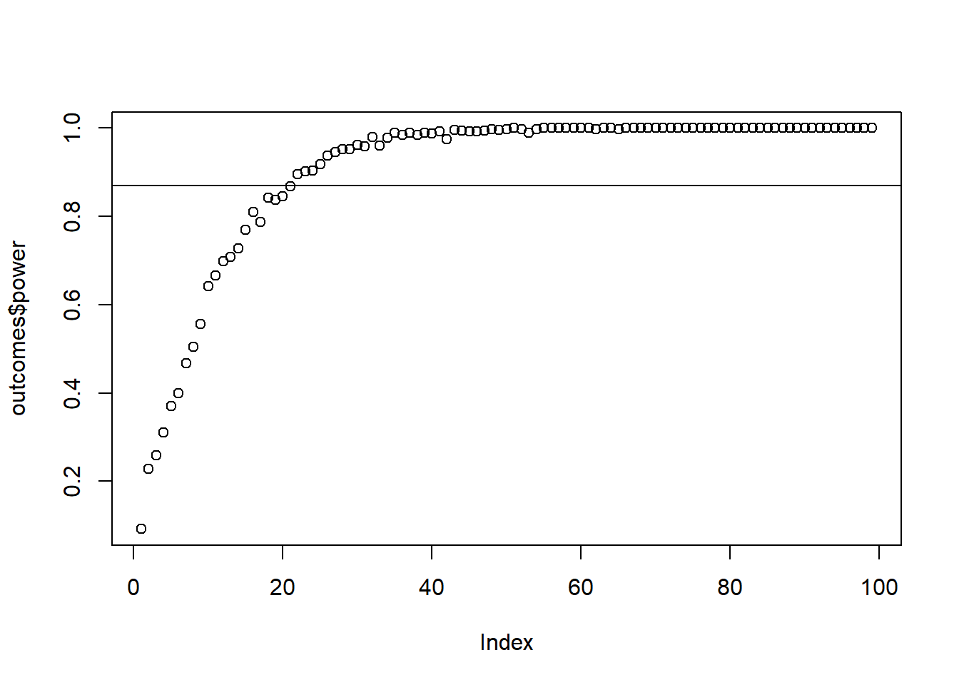
This exercise is about you trying out the variance-covariance matrix. First, you declare your variables, like we did before. Essentially, you store every parameter from the instructions.
runs <- ?
min_sample <- ?
max_sample <- ?
means <- c(before = ?, after = ?)
pre_sd <- ?
post_sd <- ?
correlation <- ?

# store our results
outcomes <-
  data.frame(
    sample_size = NULL,
    power = NULL
  )
As a next step, you need to specify the variance/covariance matrix. For that, you’ll need the variance (so squared SD) and the correlation between pre- and post-measure.
sigma <-
  matrix(
    c(
      # pre SD squared,
      correlation * pre_sd * post_sd,
      correlation * pre_sd * post_sd,
      # post SD squared
    ),
    ncol = ?
  )
Now you have everything you need. Everything else is just as before: Loop over the sample size, which again loops over a number of simulations. For each run, you create correlated scores with the mvrnorm function, then run a paired t-test.
for (asample in min_sample:max_sample) {

  pvalues <- NULL

  for (arun in 1:runs) {
    d <- as.data.frame(
      mvrnorm(
        ?,
        ?,
        ?
      )
    )

    t <- t.test(?, ?, paired = TRUE, alternative = "less")

    pvalues[?] <- t$p.value
  }

  # don't forget to store the outcomes
}
You can plot the results with plot(outcomes$power); abline(h = 0.87).
How does the correlation between measures influence the power of your test? Do the above simulation again, but this time try out correlations between pre and post scores of 0.3, 0.5, 0.7. What do you expect to happen?
runs <- 500
min_sample <- 2
max_sample <- 100
means <- c(before = 4, after = 5)
pre_sd <- 1.7
post_sd <- 1.5
correlations <- c(small = 0.3, medium = 0.5, large = 0.7)

outcomes <-
  data.frame(
    correlation = NULL,
    sample_size = NULL,
    power = NULL
  )


for (acor in correlations) {

  sigma <-
    matrix(
      c(
        pre_sd**2,
        acor * pre_sd * post_sd,
        acor * pre_sd * post_sd,
        post_sd**2
      ),
      ncol = 2
    )

  for (asample in min_sample:max_sample) {

    pvalues <- NULL

    for (arun in 1:runs) {
      d <- as.data.frame(
        mvrnorm(
          asample,
          means,
          sigma
        )
      )

      t <- t.test(d$before, d$after, paired = TRUE, alternative = "less")

      pvalues[arun] <- t$p.value
    }

    outcomes <-
      rbind(
        outcomes,
        data.frame(
          correlation = acor,
          sample_size = asample,
          power = sum(pvalues<0.05)/length(pvalues)
        )
      )
  }
}

ggplot(outcomes, aes(x = sample_size, y = power, color = as.factor(correlation))) + geom_line() + theme_classic() 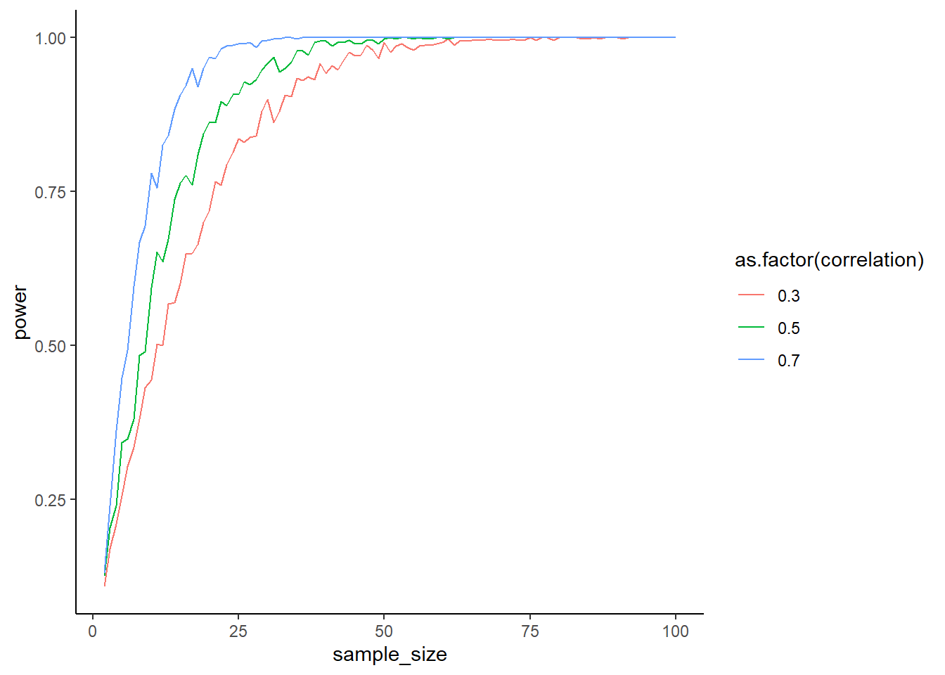
This time, the variance-covariance matrix changes because the correlation between measures changes. That means you need to create a variance-covariance matrix for each correlation (aka inside that loop level). The structure below should help
# iteratre over correlations
for (acor in correlations) {

  sigma <- ?

  for (asample in min_sample:max_sample) {

    # empty storage for p-values

    for (arun in 1:runs) {
      # for each run, do mvrnorm and store the p-value
    }

    # store correlation, sample size, and power in a data frame
  }
}What’s happening above? With higher correlations, you also have more power. The formula for Cohen’s \(d\) for a paired samples t-test is different from the independent samples t-test one:
\(Cohen's \ d = \frac{M_{diff}-\mu_o}{SD_{diff}}\)
(\(\mu_0\) is 0 because our H0 is no difference). Show the effect of the correlation between the scores on effect size with a simulation. The pre-score has a mean of 5 and an SD of 1.1; the post-score has a mean of 5.2 with an SD of 0.8. Go with a sample size of 100.
Simulate the samples with different correlations between the scores, ranging from 0.01 to 0.99. For each correlation, run 1,000 samples, then calculate Cohen’s \(d\) and get the mean of \(d\) for this correlation. Then plot \(d\) for the range of correlations. (Tip: You can create the correlations in such small steps with seq.)
means <- c(before = 5, after = 5.2)
n <- 100
runs <- 1e3
pre_sd <- 1.1
post_sd <- 0.8
correlations <- seq(0.01, 0.99, 0.01)

outcomes <- data.frame(
  correlation = NULL,
  d = NULL
)

for (acor in correlations) {

  sigma <-
    matrix(
      c(
        pre_sd**2,
        acor * pre_sd * post_sd,
        acor * pre_sd * post_sd,
        post_sd**2
      ),
      ncol = 2
    )

  ds <- NULL

  for (arun in 1:runs) {
    d <- as.data.frame(
    mvrnorm(
      n,
      means,
      sigma
    )
  )

  difference <- d$before-d$after

  cohens_d <- (mean(difference) - 0) / sd(difference)
  ds[arun] <- cohens_d
  }

  outcomes <-
    rbind(
      outcomes,
      data.frame(
        correlation = acor,
        d = mean(ds)
      )
    )
}

plot(outcomes$correlation, abs(outcomes$d))
So this time we’re not looking at p-values; we’re looking at \(d\). Like above, we declare our variables first.
means <- c(before = ?, after = ?)
n <- ?
runs <- ?
pre_sd <- ?
post_sd <- ?
correlations <- seq(0.01, 0.99, 0.01)

outcomes <- data.frame(
  correlation = NULL,
  d = NULL
)
Then you need to iterate over every correlation. For each correlation, you need a separate variance-covariance matrix. Once you have that, you do your regular for-loop, except this time you calculate Cohen’s \(d\), not significance. You then store all of those and take the mean for your outcome.
for (acor in correlations) {

  sigma <- /

    # somewhere to store the correlations
  ds <- NULL

  # then get 1,000 samples for 1,000 ds
  for (arun in 1:runs) {
    d <- as.data.frame(
    mvrnorm(
      ?,
      ?,
      ?
    )
  )

  difference <- d$before-d$after

  cohens_d <- # translate the formula for Cohen's d into R code (you'll need the difference)

  # store the result
  ds[?] <- cohens_d
  }

  # store the results for this correlation
  outcomes <-
    rbind(
      outcomes,
      data.frame(
        correlation = ?,
        d = mean(d?)
      )
    )
}
Then plot the effect size against the correlation with plot(outcomes$correlation, abs(outcomes$d)).
Now you see how standardized effect sizes can become quite the problem: With an increase in the correlation between measures, your \(SD_{diff}\) becomes smaller, whereas the means remain unchanged. In other words, the effect sizes becomes larger with decreasing SD because the difference in means turns into more standard deviation units.
It’s hard–if not impossible–to have an intuition about what Cohen’s \(d\) you can go for because you’ll need to know the means, SDs, and their correlations. If you know those, you have enough information to work on the raw scale anyway–and as we know, the raw scale is much more intuitive.
You can showcase how hard that intuition is by skipping straight to the difference score. That’s what a paired samples t-test is: it’s a one-sample t-test of the difference between scores against H0, so for demonstration you can also simulate from the difference. t.test(control, treatment, paired = TRUE) is the same as t.test(difference, mu = 0) (if our H0 is indeed 0).
Simulate power for Cohen’s \(d\) of 0.4 in a paired sampled t-test, using difference scores. That means you just need a normal distribution of difference scores. How do you know the \(d\) is 0.4? Well, choose a mean that’s 40% of whatever SD you specify.
Use 1,000 runs and while to stop whenever you reach 93% power, starting at a sample size of 20. Verify with GPower.
mean_difference <- 0.4
mean_sd <- 1
runs <- 1e3

power <- 0

n <- 20

outcomes <-
  data.frame(
    sample_size = NULL,
    power = NULL
  )

while (power < 0.93) {

  pvalues <- NULL

  for (i in 1:runs) {

    difference <- rnorm(n, mean_difference, mean_sd)
    t <- t.test(difference, mu = 0)

    pvalues[i] <- t$p.value

  }

  power <- sum(pvalues < 0.05) / length(pvalues)

  outcomes <- rbind(
    outcomes,
    data.frame(
      sample_size = n,
      power = power
    )
  )

  n <- n + 1
}

plot(outcomes$sample_size, outcomes$power)
abline(h = 0.93)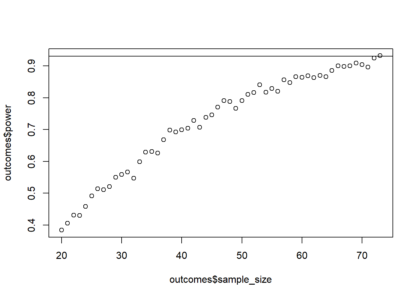
This is actually not too hard. Like always, you start with declaring your variables:
mean_sd <- ?
mean_difference <- mean_sd * 0.4
runs <- ?

# initiate power
power <- 0

# start with our sample size
n <- 20

# store outcomes
outcomes <-
  data.frame(
    sample_size = NULL,
    power = NULL
  )
Next, you define a while loop that only stops once power is high enough. Then you do your regular simulations with a one-sample t-test and store the p-values like we always do. Last, you calculate power and increase the sample size.
while (? < ?) {

  # store our p-values
  pvalues <- NULL

  for (i in 1:runs) {

    difference <- rnorm(n, ?, ?)
    t <- t.test(?, mu = 0)

    pvalues[i] <- t$p.value

  }

  power <- ?

  outcomes <- rbind(
    outcomes,
    data.frame(
      sample_size = n,
      power = power
    )
  )

  n <- ?
}You’re working for a fitness company that helps people gain muscle mass. They’re currently working on when people should measure their muscle mass: in the morning or in the evening or does that not matter?
It’s your job to find out. You know that if differences are off by less than 5%, time of measurement doesn’t matter. If it does matter, though, you need to tell customers that they need to be consistent in when they measure themselves.
Now you plan the study. It’ll be expensive: You need to provide each person with an advanced measurement scale and pay them to measure once in the morning and once in the evening.
You have resources for a maximum of 200 people. Calculate power (95%, you want to be certain) and check whether you need to collect the full sample. Go about it as you find most sensible. (Tip: There’s no correct answer–we simply don’t have enough information.)
sesoi <- 0.05
sd <- 1
runs <- 1e3

power <- 0

n <- 2

outcomes <-
  data.frame(
    sample_size = NULL,
    power = NULL
  )

while (power < 0.95 & n < 201) {

  pvalues <- NULL

  for (i in 1:runs) {

    difference <- rnorm(n, sesoi, sd)
    t <- t.test(difference, mu = 0, alternative = "greater")

    pvalues[i] <- t$p.value

  }

  power <- sum(pvalues < 0.05) / length(pvalues)

  outcomes <- rbind(
    outcomes,
    data.frame(
      sample_size = n,
      power = power
    )
  )

  n <- n + 1
}

plot(outcomes$sample_size, outcomes$power)
abline(h = 0.95)